Zero Sugar Launch
New product launch solving a portfolio-level brand contradiction under regulatory constraints.
Can a brand that taught people why sugar matters credibly sell zero sugar?
-
Context
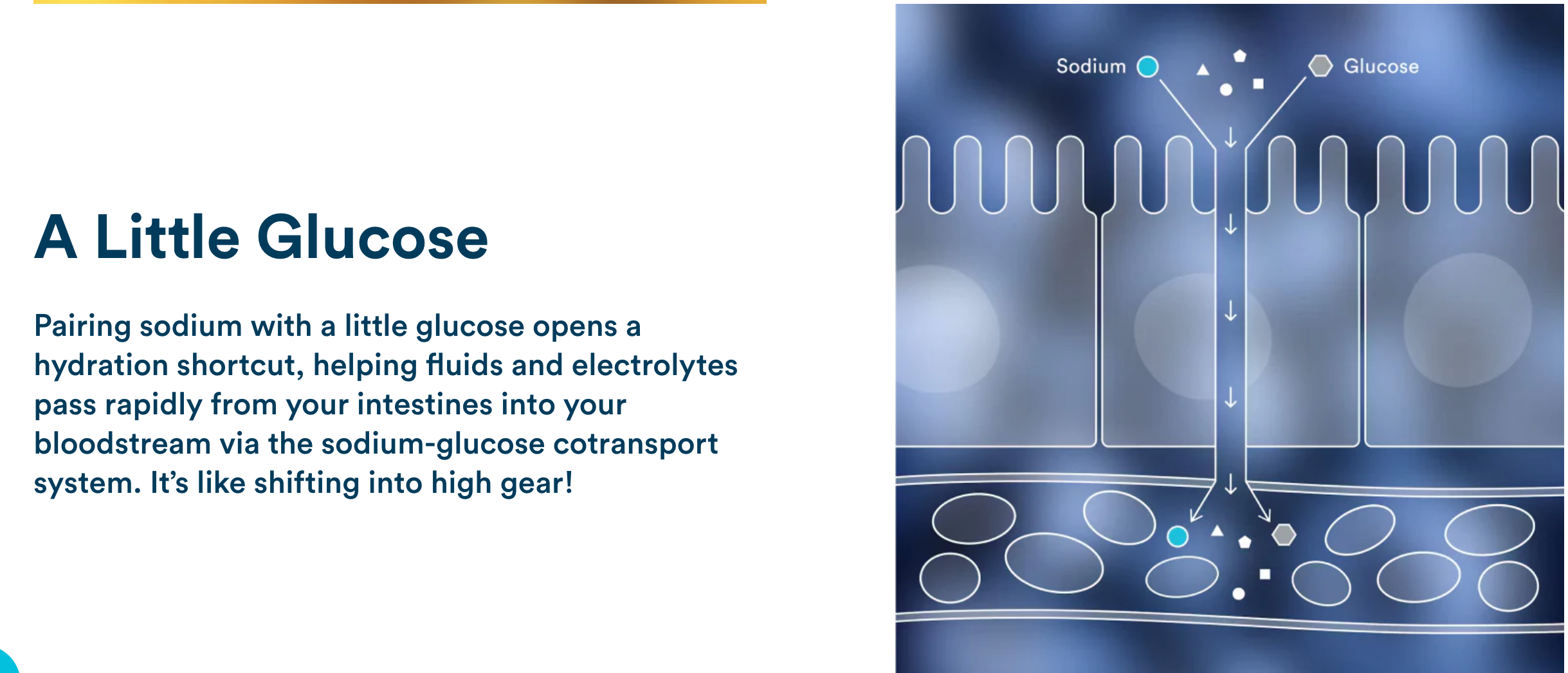
DripDrop built its brand around a clear promise: Dehydration Relief Fast. Delivering on that promise required educating consumers on a counterintuitive truth. In the context of hydration science, sugar is not a filler, but a functional ingredient that helps the body absorb water efficiently when paired with sodium. That principle, grounded in WHO-recognized oral rehydration science, became central to the brand’s credibility.
-
Goal
Over time, this message ran against broader health and wellness narratives where sugar is widely viewed as something to avoid. As demand for zero-sugar products grew, expanding the line became a commercial necessity. The challenge was introducing a zero-sugar option without undoing prior education, weakening confidence in the original formula, or reframing sugar as a mistake the brand needed to correct.
-
My Role
Led messaging and copy across the Zero launch, including packaging, website, email, paid, blog, and organic channels. Defined how brand-level promises and proof points applied across products, set guardrails for positioning Zero relative to the original formula, and ensured consistency as the product line expanded.
What Made This Launch Risky
Sugar had been central to how the brand explained effective hydration
Zero could not be framed as better without weakening the original product
Comparative claims were limited by science and regulation
The brand promise needed to hold across a growing portfolio
Language that needed to scale beyond this launch as the product line expanded
Key Decisions
-
Frame both products against water, not against each other
-
Keep Dehydration Relief Fast as a brand promise, not a comparative claim
-
Introduce Zero as a choice, not a replacement
-
Separate brand-level proof points from product-level differences
-
Avoid deep biological explanation where it creates more questions than clarity
-
Preserve familiar content structures to reduce cognitive load
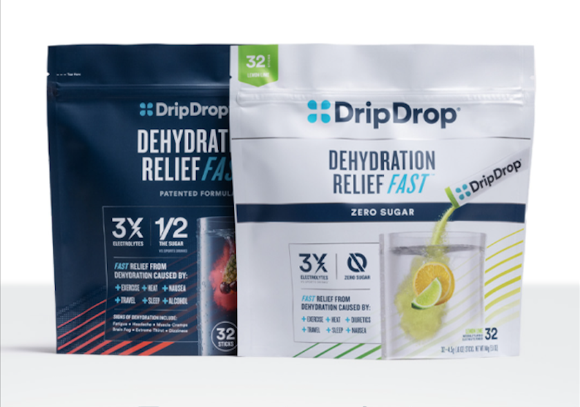
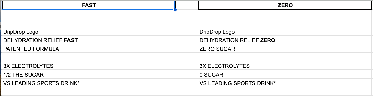
Packaging | Preserving Hierarchy Across Products
Both packages maintain the same brand promise and proof hierarchy, with product differences clearly separated at a secondary level. This approach allowed Zero to enter the portfolio without reframing the original formula or creating an implied upgrade path.
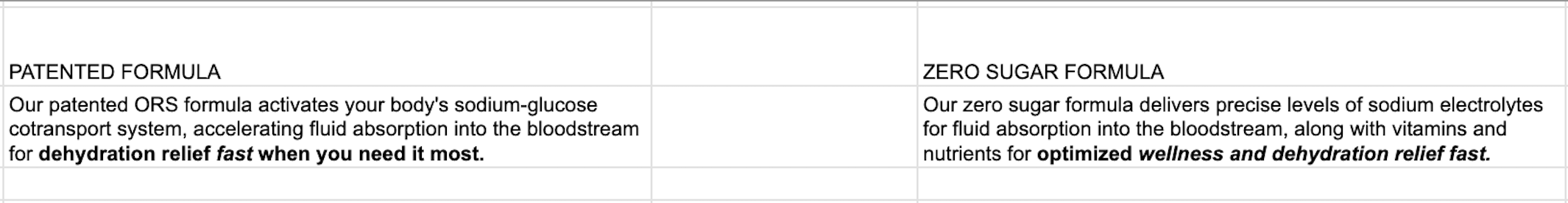
Back of Pack | Formula-Level Language Discipline
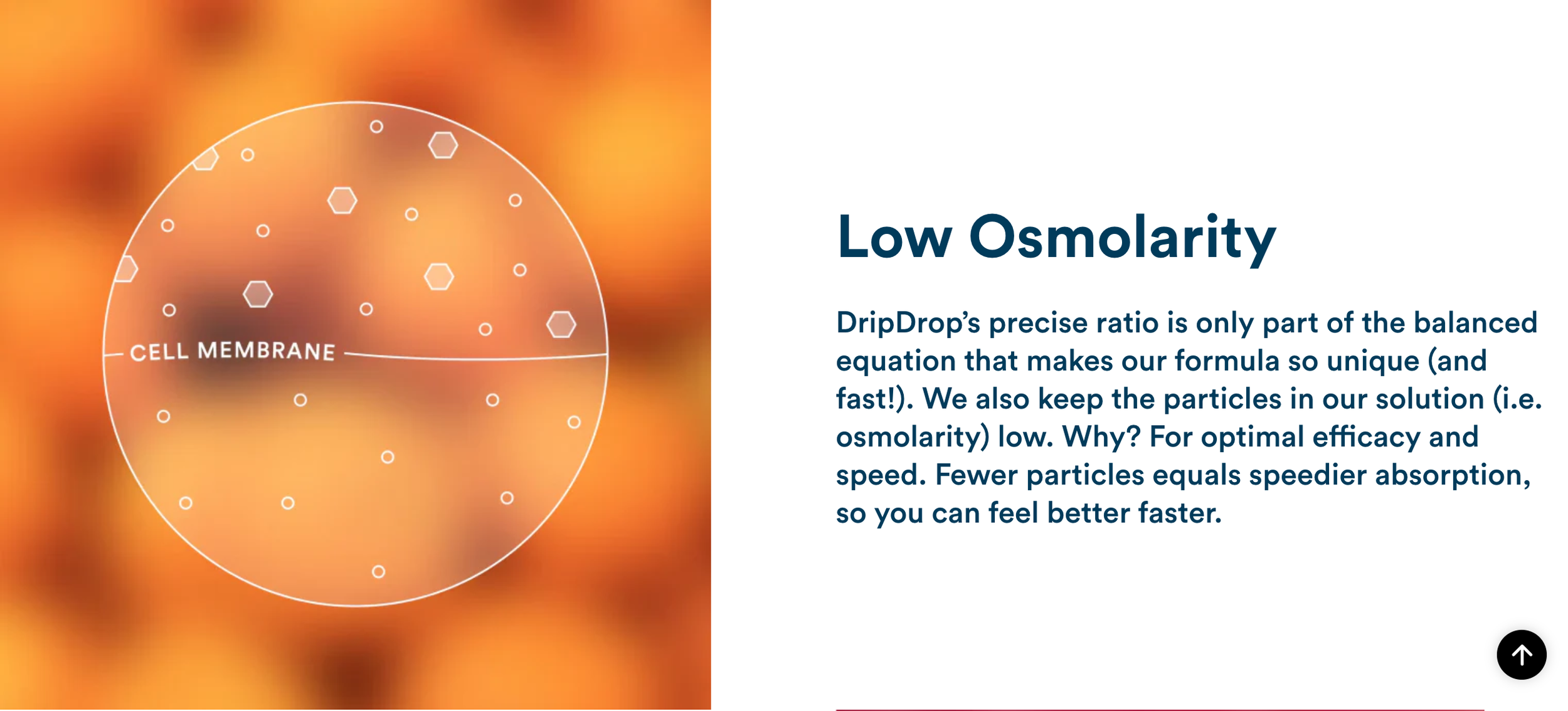
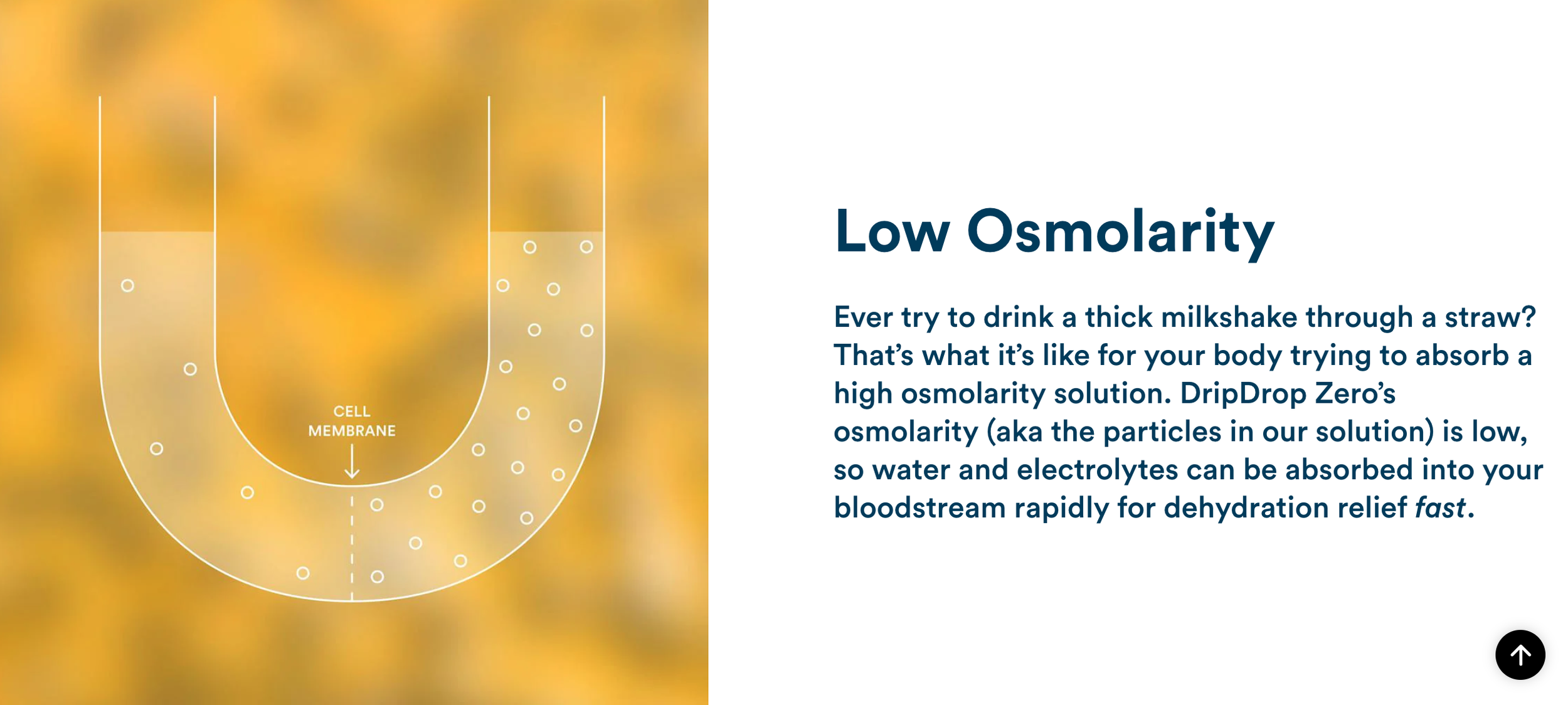
Formula explanations were intentionally written in parallel, but not mirrored. While both products retained the same brand promise and comparative framing, the underlying science was described differently to reflect how each formula actually worked. This allowed Zero to be explained credibly without borrowing language that had been foundational to the original formula, avoiding unnecessary comparison or contradiction.
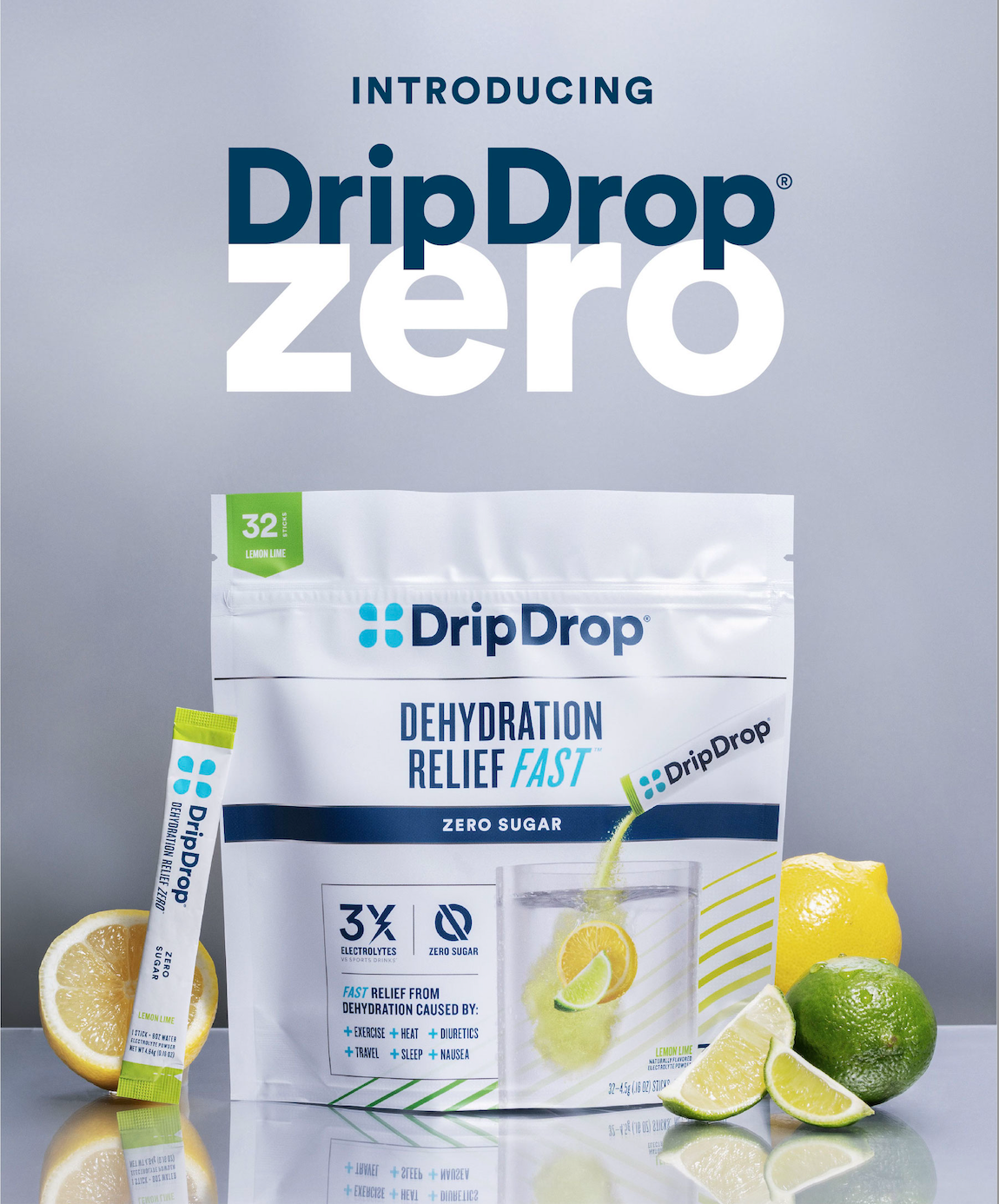
Teaser | Zero Sugar Launch
With the launch, we led with intrigue, letting anticipation build before introducing any claims or context.
Supporting copy:
Guess what!?! Something you’ve been waiting for is about to (Drip)Drop.
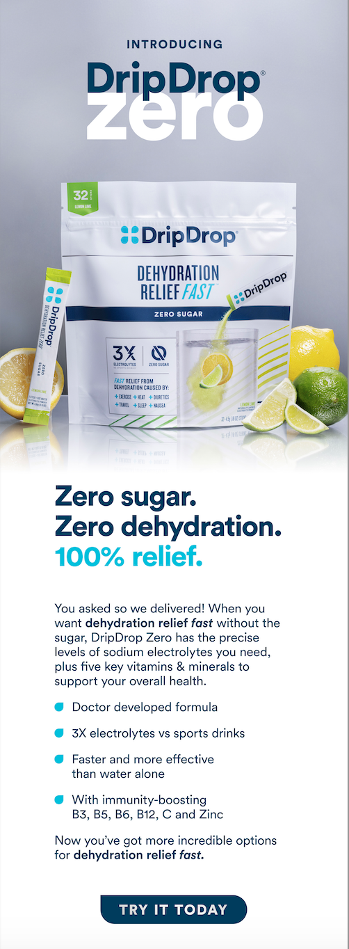
Launch Email | Introducing Zero Without Rewriting the Brand Story
The launch email introduced Zero using the same brand promise and proof framework customers already recognized, without positioning it as a correction or upgrade. “Dehydration Relief Fast” remained the anchor, while Zero’s benefit was framed through preference and fit rather than superiority.
Language emphasized continuity and choice, allowing the new product to enter the ecosystem without undermining trust in the original formula or revisiting past education.
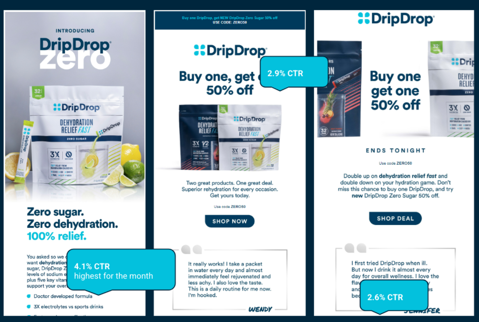
Top Performing Emails | CTR
These launch emails didn’t just introduce Zero Sugar; they performed. Strong click-through rates reinforced that the positioning and framing resonated, helping validate the launch strategy across both brand and commercial goals.
Website | Analogous “How It Works” System
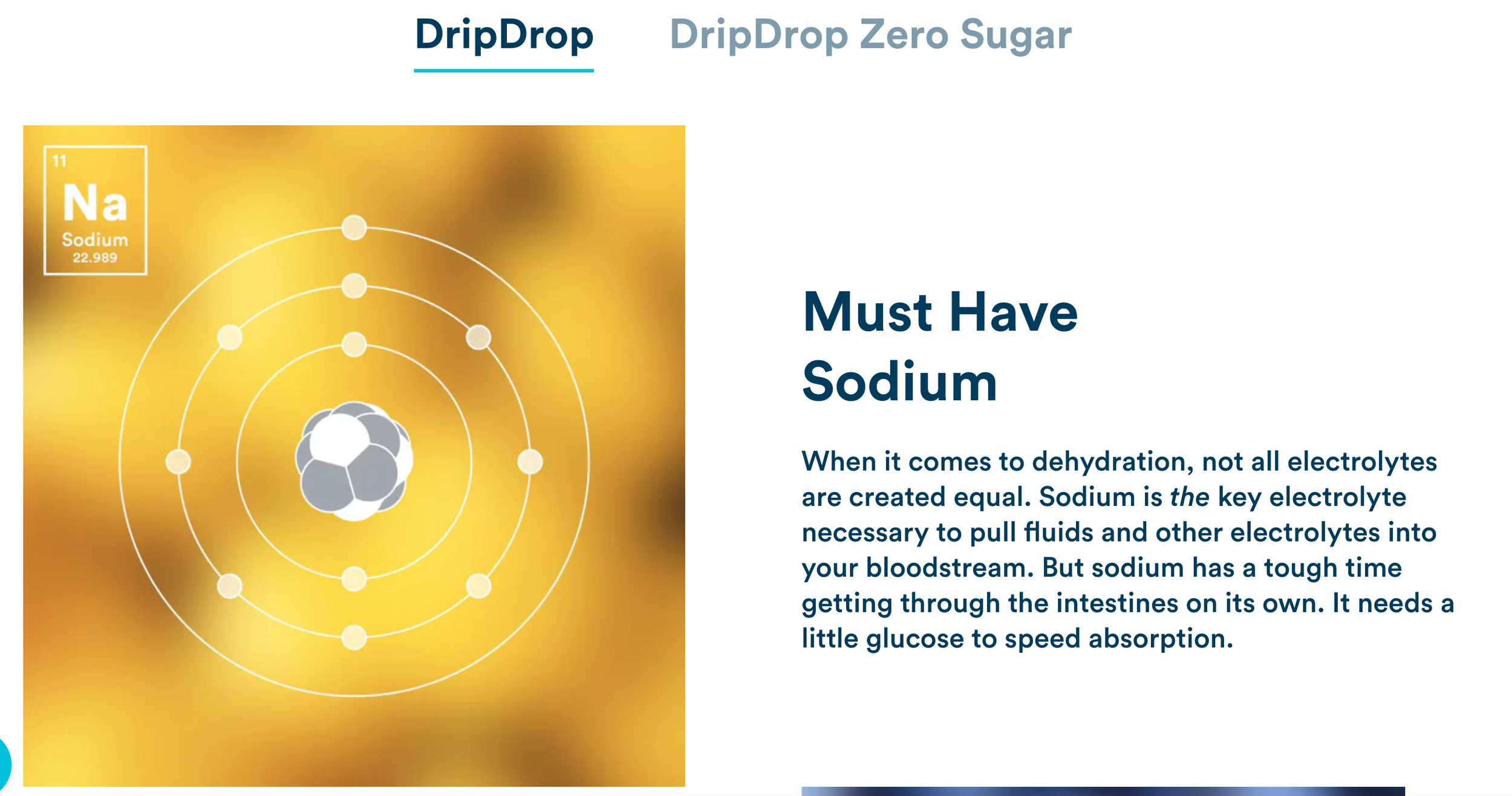
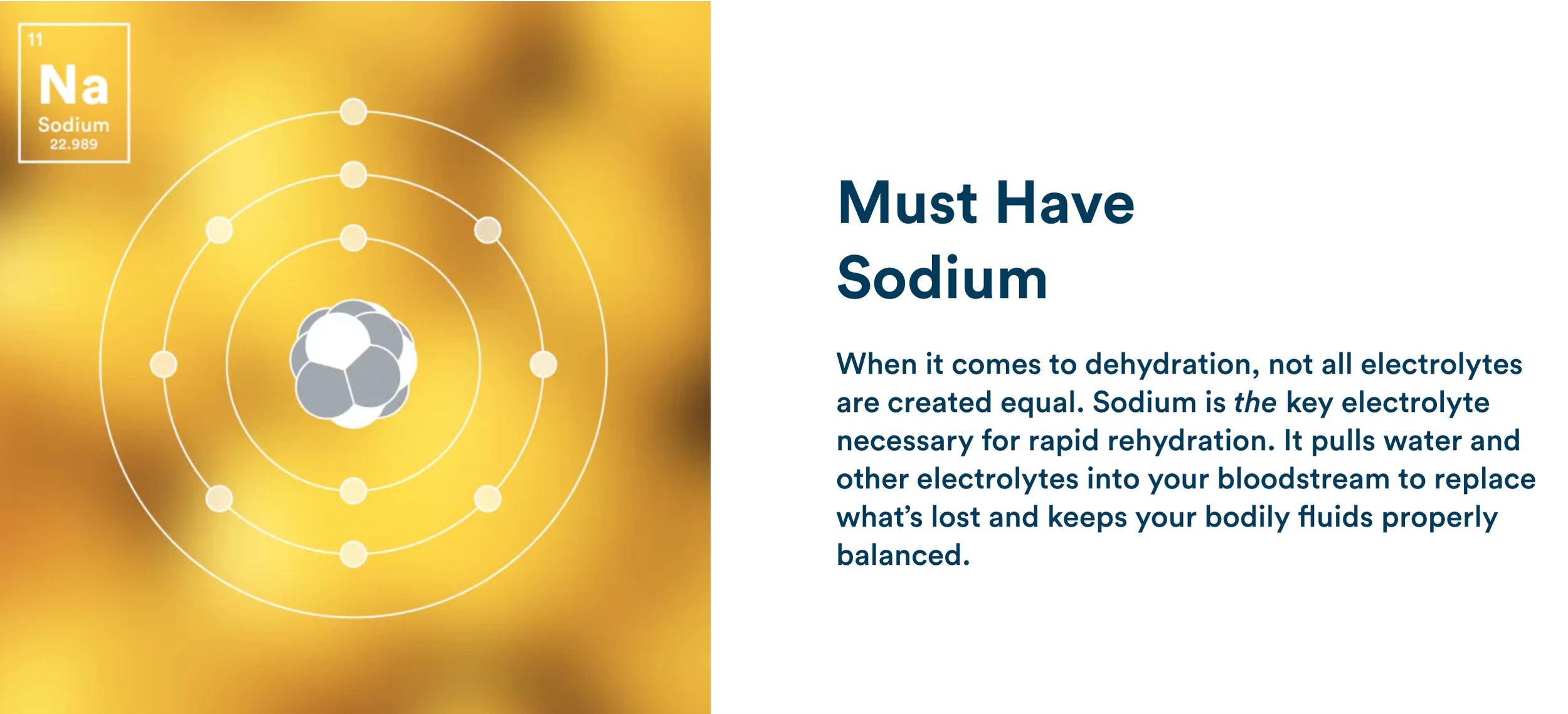


Website | Scaling the “How It Works” Framework Across Products
Rather than introducing a new explanatory framework for Zero, the website reused the existing “How It Works” structure customers already trusted.
Panels were designed to feel familiar at a glance, preserving brand-level promises around speed, taste, and efficacy, while allowing formula-specific differences to appear only where they were scientifically necessary.
Some sections remained nearly identical across products. Others intentionally diverged. The goal was continuity without oversimplification, helping users understand what mattered without forcing them to relearn the brand.
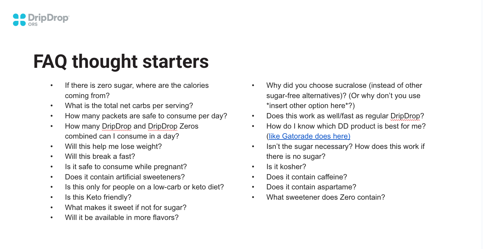
FAQ | Anticipating the Real Questions
Rather than waiting for confusion to surface, I identified the most common questions customers would naturally ask and addressed them head-on by explaining how Zero fits alongside the original formula without undermining either.
This FAQ framework became a repeatable way to resolve hesitation across channels, pairing empathy with accuracy and reinforcing trust at the moment it mattered most.
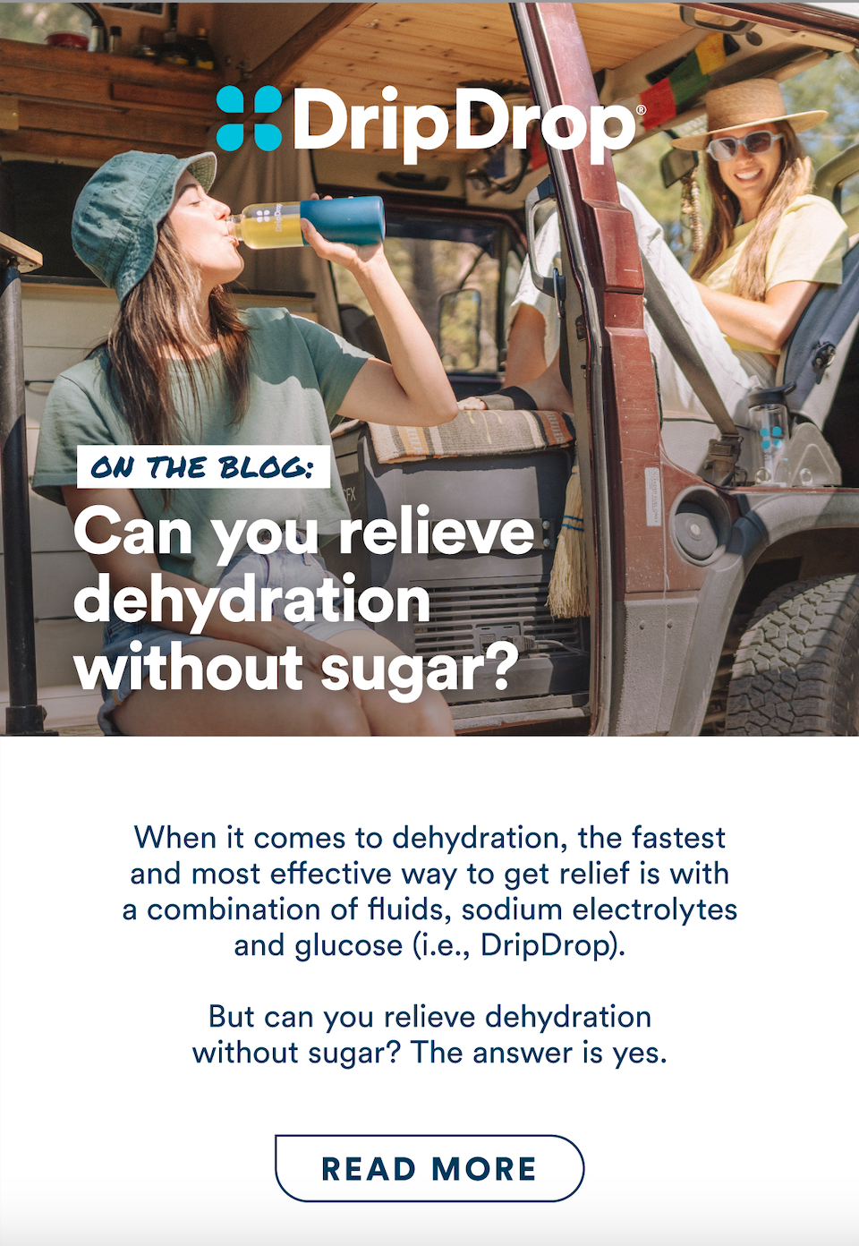
Education | Addressing the Obvious Question
Introducing a zero-sugar product raised a question we couldn’t ignore. Removing sugar without explanation would have undermined years of education and trust.
Rather than soft-pedaling the science or fragmenting the answer across channels, we addressed the question directly with an educational piece designed to clarify when sugar matters, when it doesn’t, and why both products could exist honestly within the same system.
→ Read the full explanation: Can you relieve dehydration without sugar?
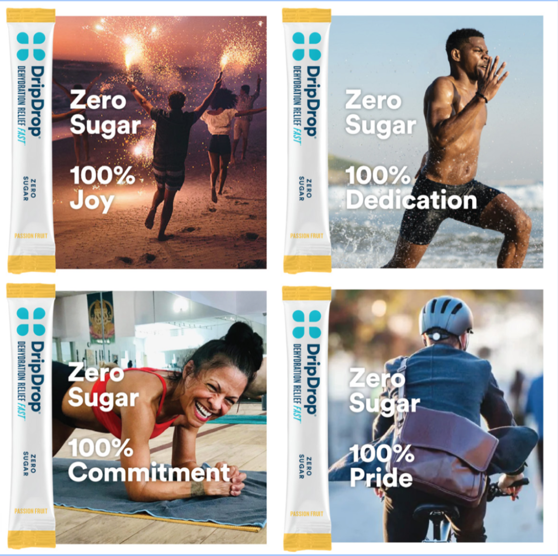
Campaign Expression | Zero as a Lifestyle Choice
Once the science and hierarchy were clearly established, Zero didn’t need to explain itself. The campaign shifted from education to expression—showing how the same product could support different moments, motivations, and identities without redefining the brand.
By keeping the product system consistent and allowing the creative to flex emotionally, Zero entered culture as a choice, not a compromise.
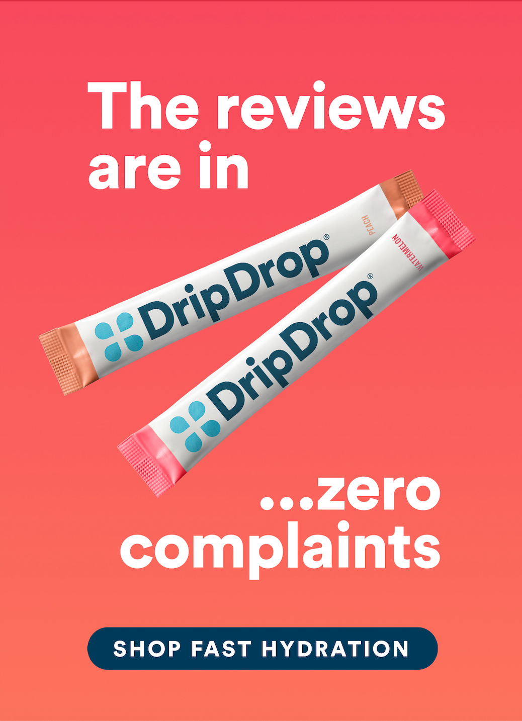
Campaign Expression | Testimonials
As Zero gained traction, creative shifted from explanation to affirmation. This message used customer social proof and smart wordplay to reflect growing confidence in how the product was understood and received.
What Happened
Zero was initially expected to be a small extension of the portfolio. Instead, it quickly became the fastest-growing product line.
Because Zero was introduced as a clear choice within a coherent system, it scaled without eroding trust in the original formula. Customers understood when to choose it, why it existed, and how it fit alongside the original product.
That clarity shaped what came next. Rather than expanding the original formula, the next innovation built on Zero itself with the launch of Zero Sugar Plus.