wysefit
Diagnosing why a well-intentioned fitness app lost user trust before users ever completed a workout
wysefit was an early-stage mobile fitness app designed for adults 60+ to exercise safely at home. I joined the project as a contract copywriter, initially brought in to make the app’s language more friendly and accessible. As I worked through the experience, it became clear the core issue wasn’t tone or motivation. Users didn’t understand what was free, how plans were created, or what would happen next. The result wasn’t confusion alone, but early loss of trust.
This case study documents a short, UX sprint where I co-owned research, synthesis, and journey framing with a UX designer to make that breakdown visible and actionable for stakeholders.
-
My Role
UX Writer and Research Partner (with UX Designer)
-
Engagement
UX sprint, 1–2 months
-
Product Stage
Live app, early traction, limited UX foundation
-
Primary Focus
Onboarding clarity, comprehension, and trust
What Made This Work Risky
The app was live, with paying users, but no shared understanding of where trust was breaking down
The founder was skeptical of UX work and hesitant to invest time without clear upside
There was no existing research, journey mapping, or usability foundation to build from
The audience skewed older, making clarity, legibility, and expectation-setting non-negotiable
The engagement needed to show value quickly, without a full redesign or long roadmap
Key Decisions
-
Frame early confusion as a trust problem, not just usability friction
-
Focus the sprint on onboarding and early learning, while acknowledging future expansion
-
Make system logic explicit before relying on motivation or personality
-
Clarify what happens next at every step of the experience
-
Treat pricing transparency as a trust signal as well as a conversion lever
-
Use journey mapping to reveal emotional drop-off, not just task failure
Phase 1: Research & Discovery
Understanding where trust broke down and why
Comparative analysis (category norms & expectations)
Heuristic review of onboarding and pricing flows
User interviews and usability testing
Existing flow mapping
Journey mapping
Persona and scenario definition
Problem framing and design strategy

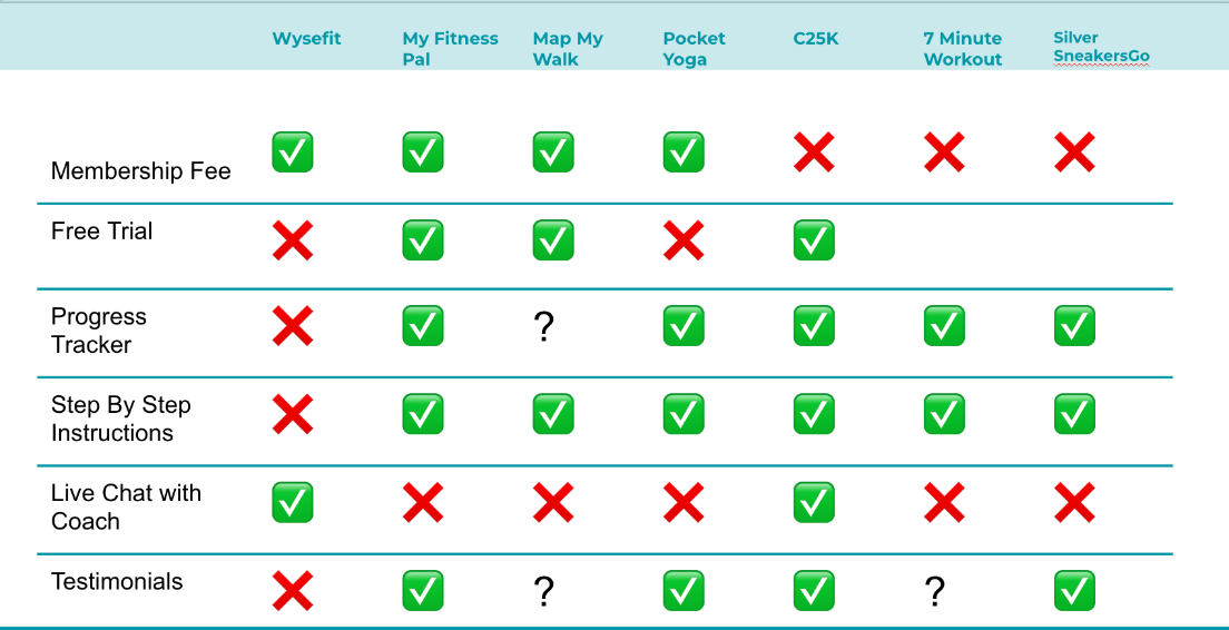
Comparative Analysis | We started by looking at how similar fitness apps introduced pricing, plans, and progression.

Talking with Users | Then paired that with direct user research to understand where the wysefit experience diverged from expectations.
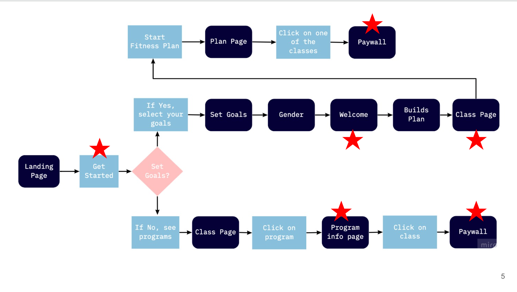
Mapping the Flow | Individually, the issues looked minor. Mapped together, a clear pattern emerged: confidence declined rapidly once users encountered unclear plan logic, pricing, and next steps.
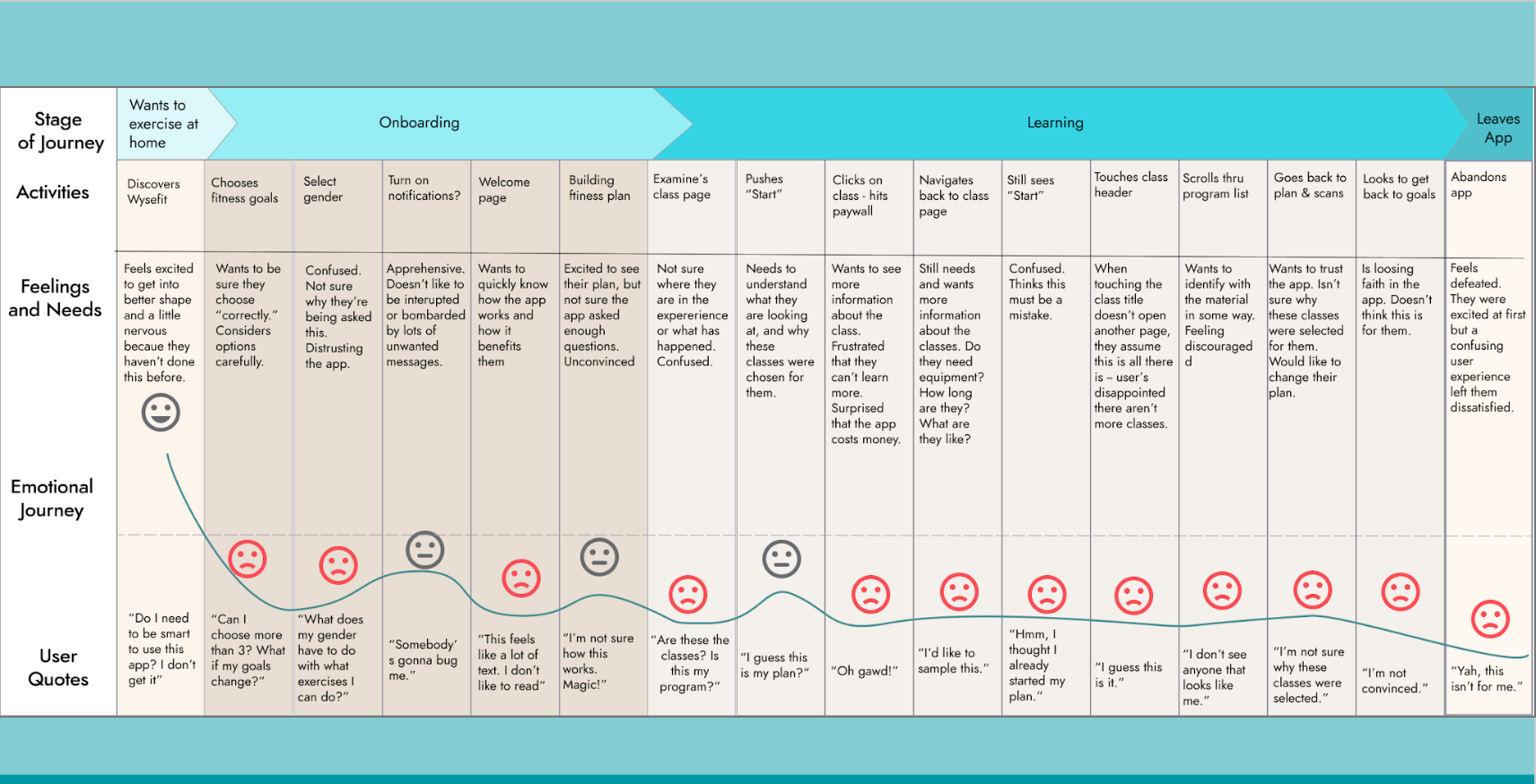
Journey Mapping | When viewed end to end, minor usability issues combined into a clear emotional drop-off driven by unclear plans, pricing, and next steps.
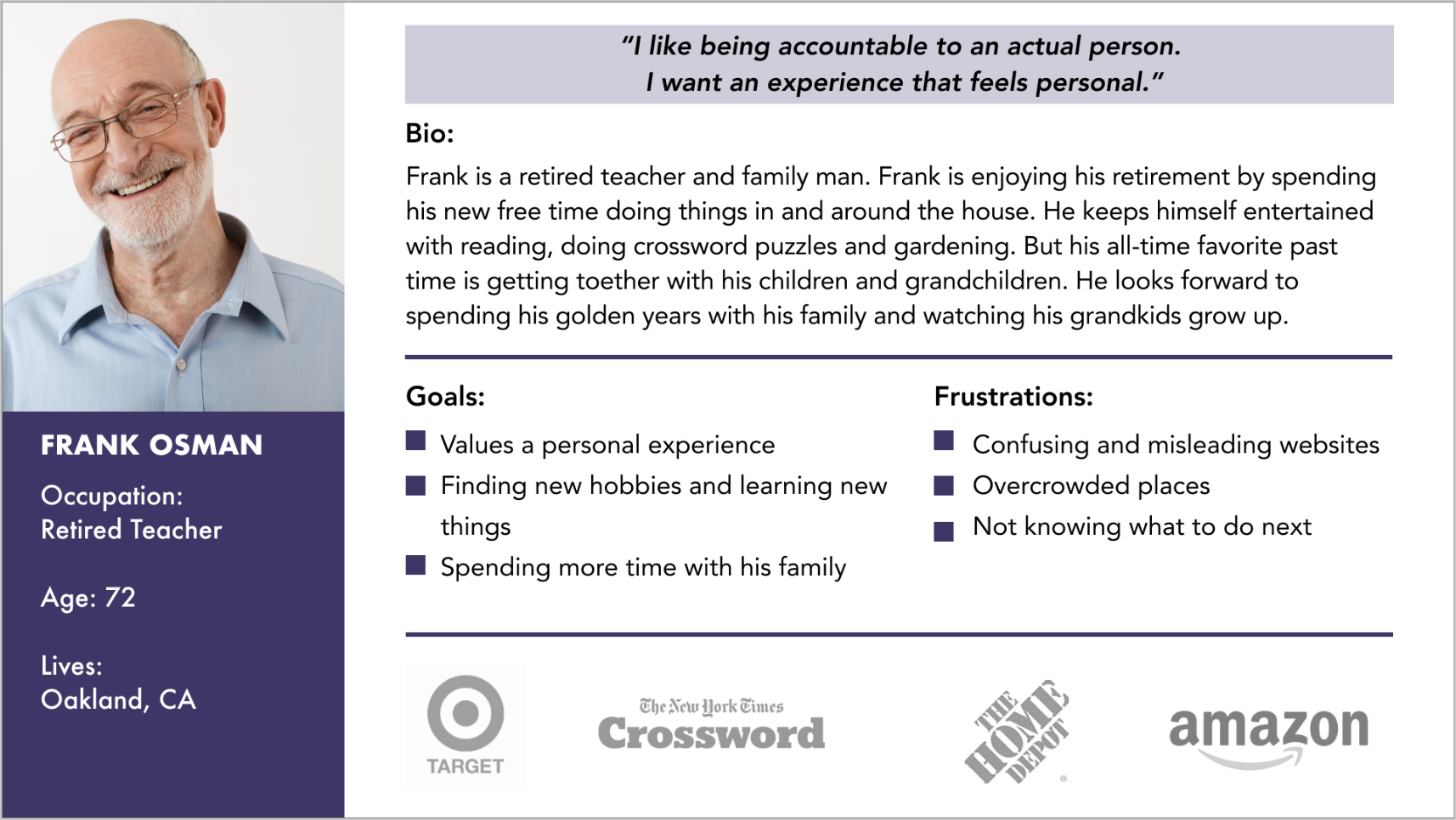
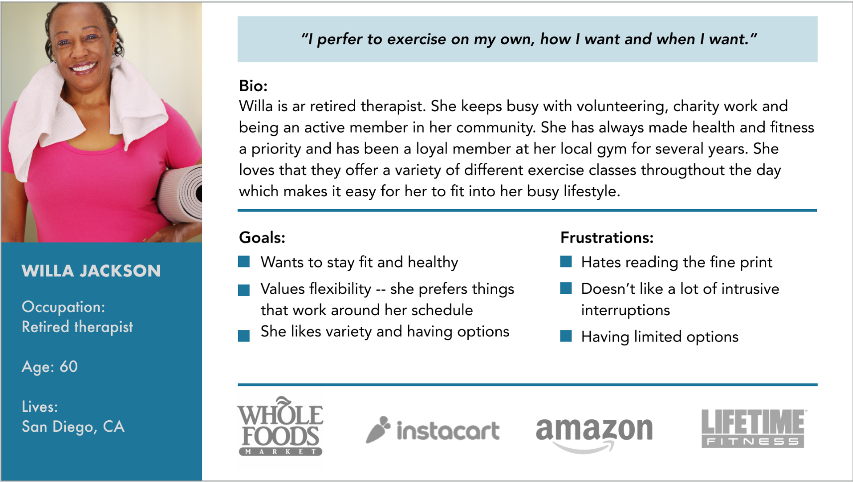
Personas | These journeys represent two distinct user mindsets, showing how the same system breakdowns affected users with different goals and expectations.
How Might We…
Help both personas understand wysefit’s offerings well enough to trust it and commit?
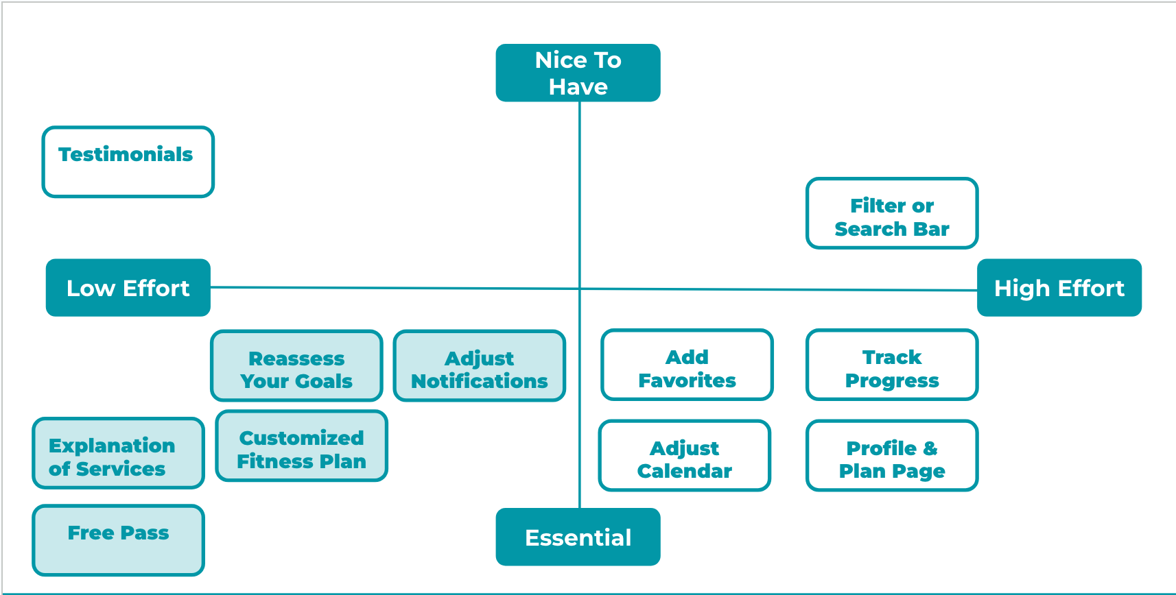
Feature Prioritization Matrix | This matrix translated research insights into action, guiding our revised onboarding flow by clarifying which features needed to be addressed immediately and which could wait.
Phase 2: Design, Validate, and Align
Translating research into a clearer onboarding experience and a shared path forward
Revised onboarding and plan-selection flows
Low- and mid-fidelity wireframes and prototypes
Iterative testing and refinement
Content updates to improve clarity and expectation-setting
Stakeholder walkthroughs and recommendations
Prioritized next steps for future sprints

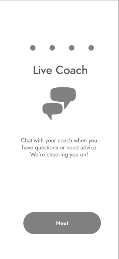
Welcome Screen
This screen was designed to quickly ground users in what wysefit is, who it’s for, and what will happen next, before asking them to make any decisions.
The following flows show how we applied this principle across onboarding by making system logic visible, setting expectations early, and reducing cognitive load at each decision point.
Flows | Designing Trust Before Action
Revised Onboarding Flow | Clarity at a Glance


-
Landing Page
Sets expectations immediately.
Introduces wysefit with more inclusive imagery and clearer language, emphasizing safety, guidance, and ease over intensity or performance. -
How It Works
Explains system before asking for commitment.
Breaks the product into three core offerings so users understand what they’re getting and how the app is structured. -
Memebership Benefits
Reinforces value and removes surprise.
Recaps everything included, confirms that wysefit is a paid membership, and gives users control over whether to explore more or sign up.
Persona Flow | Creating a Customized Plan

-
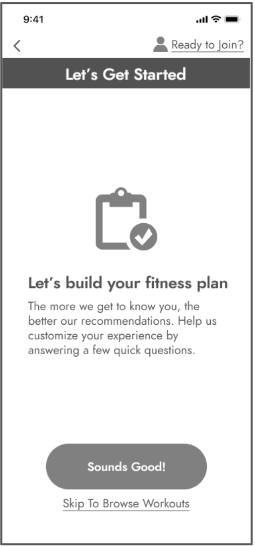
Introducing Customization
Get started
Choose to build a personalized plan or browse workouts first—no commitment required. -
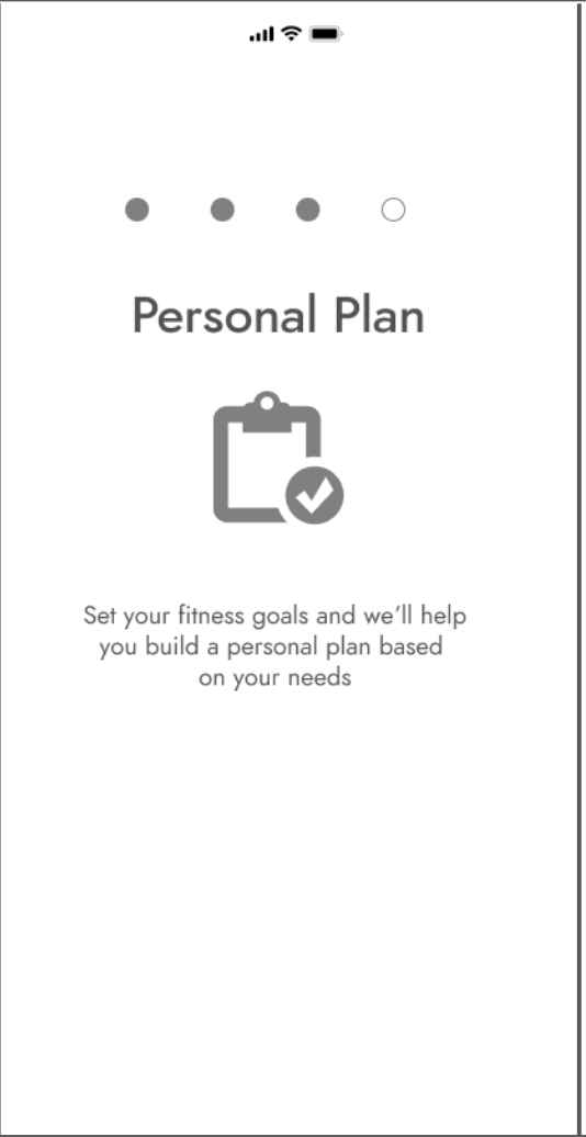
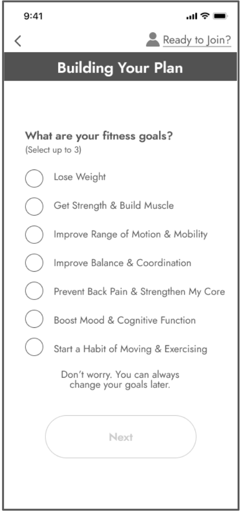
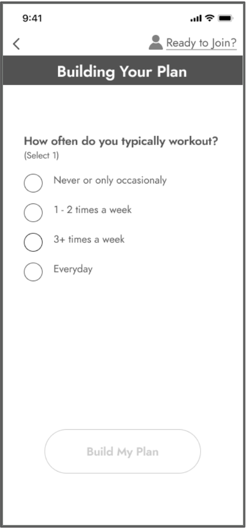
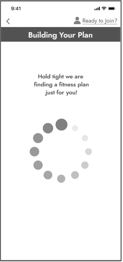
Building Your Plan
Lightweight personalization
We replaced demographic questions with goal and habit-based inputs, then showed progress while the plan was generated. -
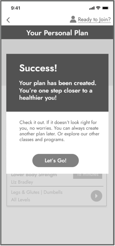
Confirmation
Clear next steps
Reinforced success, explained what was created, and made it explicit that plans can be changed or expanded anytime.
Persona Flow | Previewing Options
-
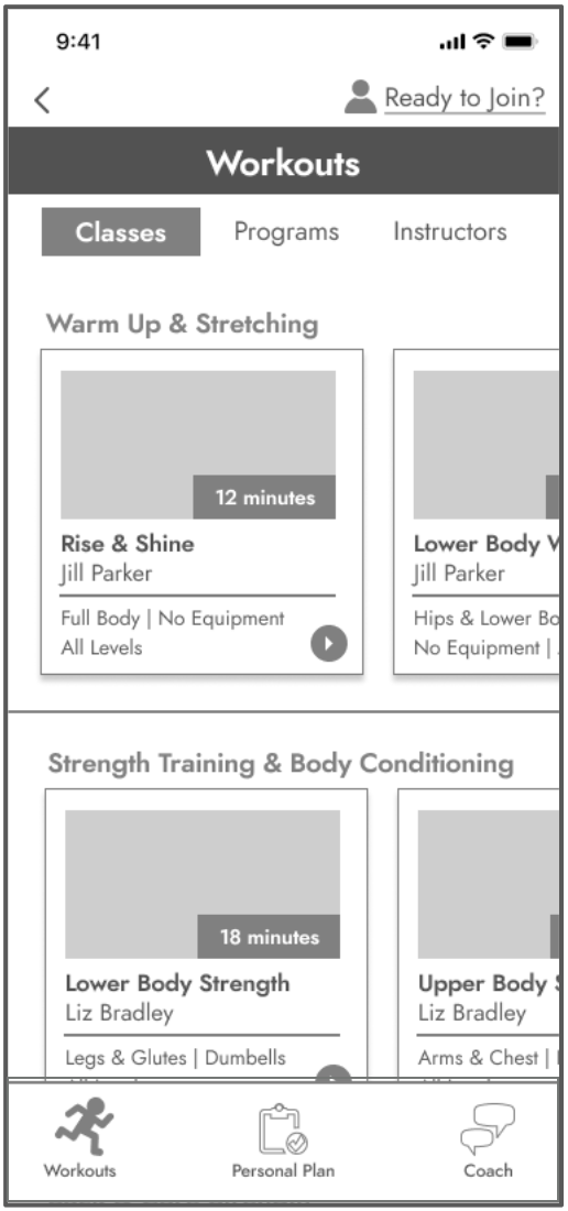
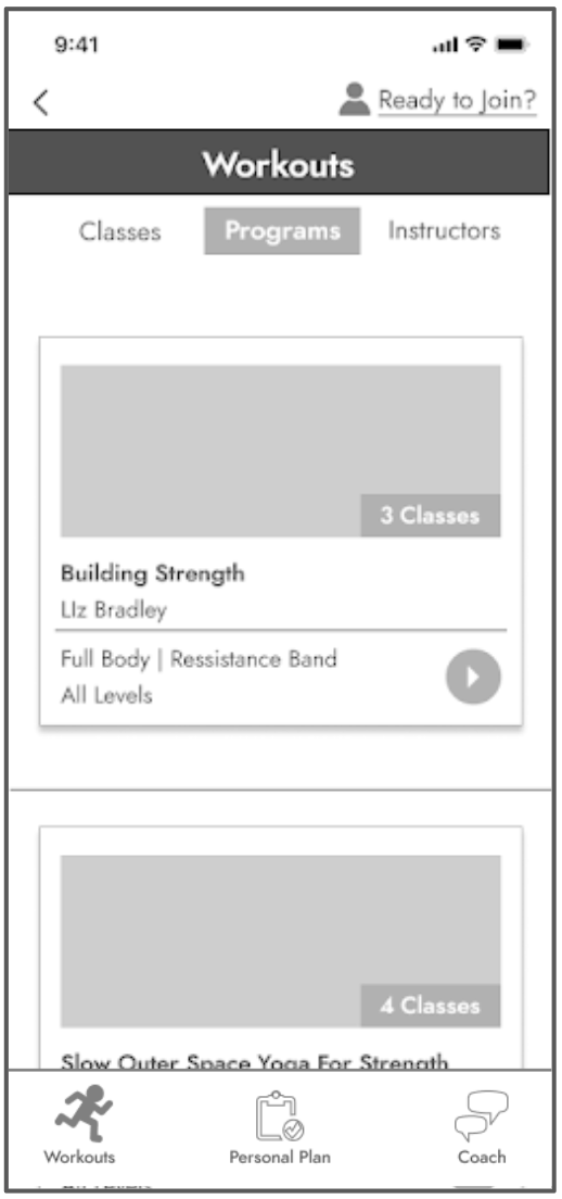
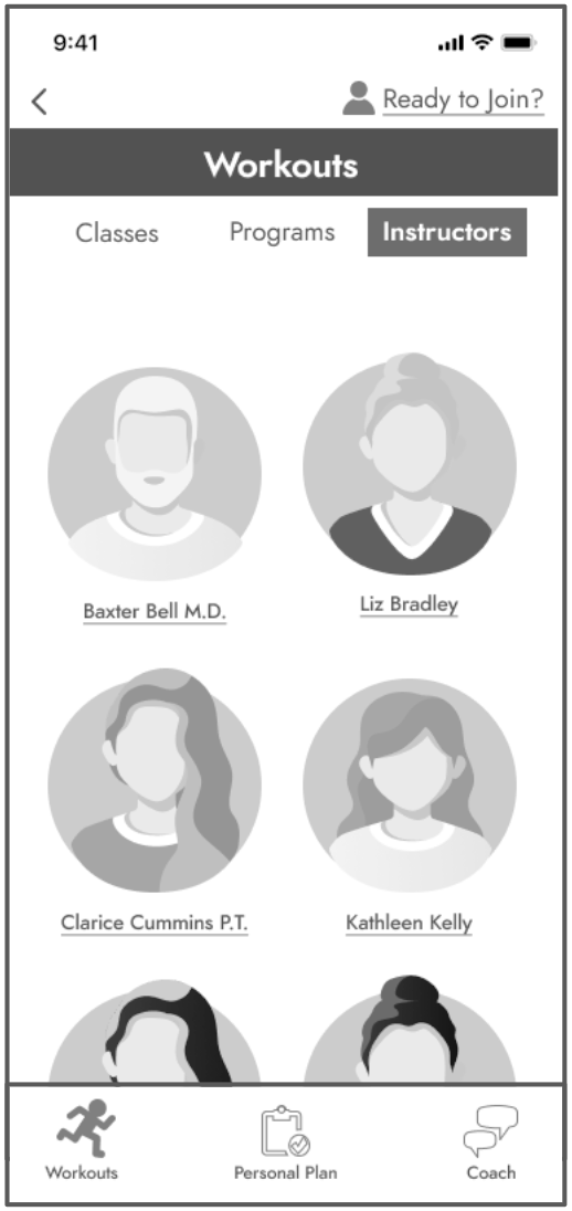
Preview Before You Pay
Let users explore before committing.
Surfacing workouts, programs, and instructors upfront reduced anxiety and helped users assess fit before being asked to join. -
Filter
Reduce friction by making choice manageable.
Clear filters across classes, programs, and instructors helped users find relevant content without feeling overwhelmed. -
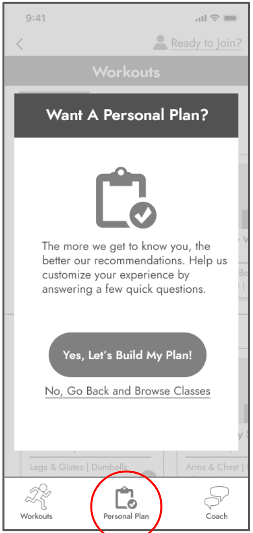
Pop Up
Invite conversion once confidence is established.
The personal plan prompt appears after exploration, reframing sign-up as a next step—not a barrier.
High-Fidelity Prototype | View the complete prototype, including onboarding, browsing, class details, and checkout flows → [View prototype]
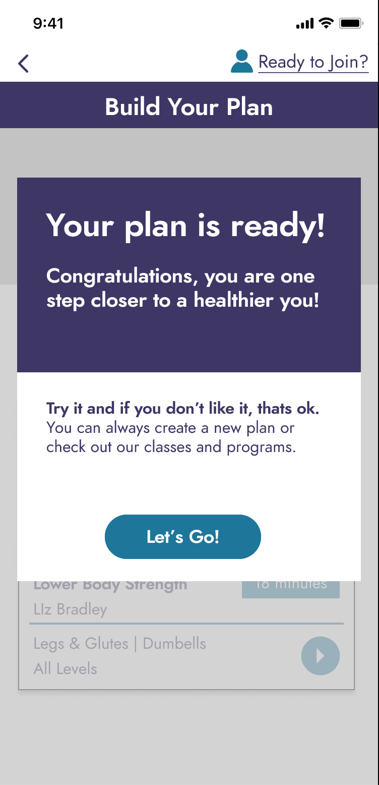
A Clear Moment of Commitment
Instead of pushing users to decide before they understood the product, the revised experience ends by confirming what was built, what comes next, and that they remain in control. This moment reframes commitment as informed and reversible, restoring trust at the point where users previously dropped off.
What Changed Because of This Work
After the sprint:
Leadership could clearly see where and why users lost trust
Confusing, circular flows were no longer framed as opinions
Pricing transparency became an explicit product issue, not a footnote
User frustration was grounded in real quotes and observable patterns
Roadmap conversations shifted from feature expansion to clarity and comprehension
Without this work, early churn risk would have remained largely invisible
This work established a stronger UX foundation and showed how targeted changes could rebuild trust without a full redesign.
Opportunities Identified for Future Sprints
Expanded filtering and search across classes, programs, and instructors
Progress tracking and integrations to support long-term engagement
Selective use of testimonials during onboarding to reinforce trust
Optional music personalization to support motivation and comfort
Favorites and quick-reference tools to support repeat use